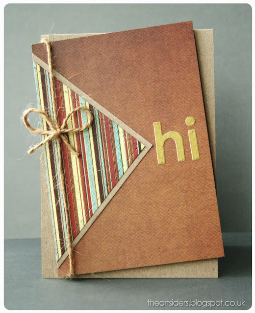
Over at Cas(e) this Sketch! there's another elegantly simple design to inspire this week's challenge.
I love simple sketches like this. You can stick hard and fast to the design or you can choose to add to it whilst still being able to recognise the inspiration behind it. Not so easy when a sketch has a lot of elements within it, to take them away and still show you've used the sketch.
For example, once I had made my card...
...I tilted the design.
It doesn't take much to turn a simple sketch into your own unique creation.
And at the moment, I'm loving the wonky look


14 comments:
Me too. Straight or wonky, it's a winner. I like that neutral background behind the stripes to give it added punch.
I concur! Your tilt is totally cool! I enjoy your style and this card is really nice! TFS :)
Nice card. Great neutral colors for a man or woman.
This is absolutely handsome!
Oh, yes, the tilt is a nice touch! I love the use of stripes, too! Such a dynamic card, Paul!
Oh WOW, what a great card. Love the little rotation on it. Thanks for playing along with us in the CAS(E) this sketch! challenge and hope to see you again.
This looks fabulous! I love how you tilted the design!
Nice. Love the colors and the simplicity.
Crisp and clean with great texture/dimension..... a wonderful interpretation of CTS #56!
Congrats Paul, on your win!
Fantastic! I just love your interpretation of this sketch. Congrats on your much deserved CTS win!
Saw this on CTS Paul - congrats on your win...love how you've tilted it and made it your own and those masculine papers are simply gorgeous
Congrats, love the design! Way to rock the CAS challenge!!!
I apologize for my late post ~
Congrats on your well deserved win at CTS! I love the Kraft card base, the really great masculine papers you chose, and how you added texture and dimension to this card! Very deserving of the win!
Post a Comment