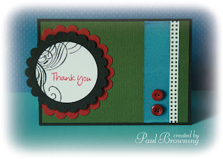
I've been a tad monochromatic recently in the crafts which I've blogged but today that's all changed thanks to the Play Date Cafe Challenge. A strong combo of red, turquoise and green make for a fest of funky colour.
As usual, I've made a card. Still no scrapbook layouts, I know. I've designed quite a few on the computer but I haven't put any time aside to print the photos out. I could do with putting an afternoon aside just to finish off all my semi-completed pages.
Not tomorrow though as it's promising nice weather and it's too good an opportunity to pass up. Now Autumn is here there won't be many Fridays left where Nick & I can take time out to visit outdoors touristy places of interest. So before the short days and rubbish weather keep us indoors we're going to take advantage of the last remnants of sun.
Supplies List:
Paper/Card: Black & Red (from scraps), Green (Bazzill Basics)
Stamps: Hero Arts, Basic Grey
Dies: Spellbinders
Stamps: Hero Arts, Basic Grey
Dies: Spellbinders
Border Punch: Martha Stewart
Other: Ribbon, Buttons
Other: Ribbon, Buttons

15 comments:
Oooo yummy. Love the asymmetric look, the swirls and the buttons. X
Very clean and simple, I like the way your card has turned out, love the buttons!
Oooo yummy. Love the asymmetric look, the swirls and the buttons. X
Great card Paul and the colours go great together
You do right to get out and enjoy the last of the sunshine! Love the way your circle is offset like this, and lovely strong colours ...
Lovely design. Great use of the colors in the clean design. Glad you found time to play along with us at the PDDC.
Love the design Paul and the way your image runs off the page...very out of the box. Super use of the colors, thanks for playing along with us at the Play Date Cafe and hope you enjoy the sunshine!
Love the design Paul and the way your image runs off the page...very out of the box. Super use of the colors, thanks for playing along with us at the Play Date Cafe and hope you enjoy the sunshine!
Wonderful CAS design! Thanks for playing at the PDCC.
Very clean but striking....you have used the colours so well.
Gorgeous blend of colours. I love the Martha Stewart border punch you've used. x
Fabulous layout! Love what you did with the colors.
Crisp and clean lines....eye-catching!!
Love it! In theory these colours shouldn't look so great together but you have made them work perfectly!!
I have a phobia of scrapbooking, only managed 2 so far and one of those definietely shouldn't ever see the light of day again lol. People tell me to think of it as a large card, think that is what scares me as I like medium and manageable sized cards lol!
Sarah
HOOOORAY for some color (or colour)!!! Just love that dark green! Love your sketch/design! So fun to come by your blog--even if it is monochromatic or full of color!!! So glad you joined in the fun:) THANKS for playing along with us at the PDCC:}
Post a Comment