
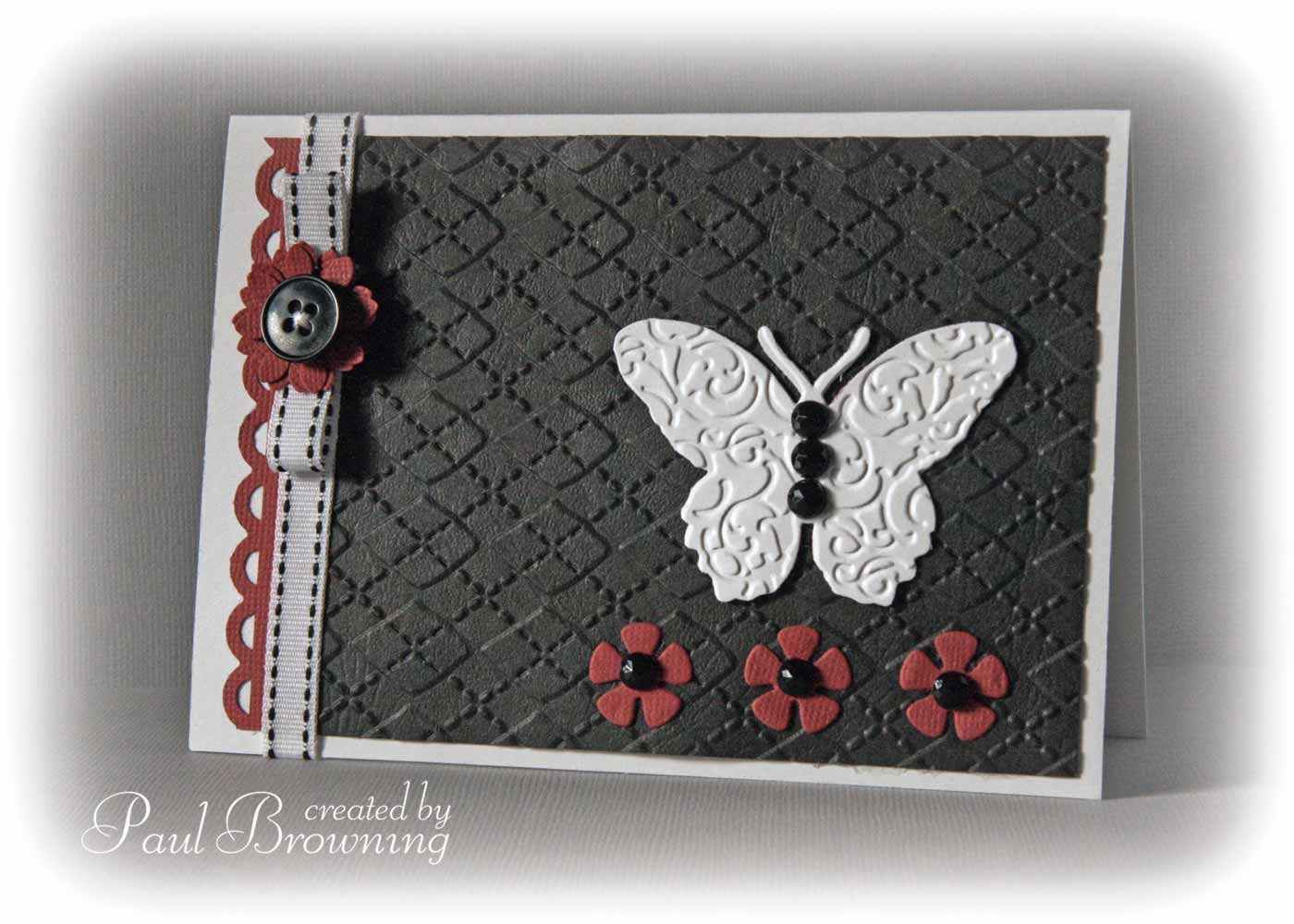
Over at the Play Date Cafe Challenge this week, it's a Hint Of... scheme. Black & White with a hintette of Burgundy. This was the colour of my bedroom when I was a teenager. I wanted all black (can you guess I was a stereotypical gloomy teen?) but it was frowned upon. So as a compromise I chose a wallpaper that was mostly black with dabs of white and painted the surrounding woodwork in deep red. It perfectly suited my dark mood.
However, it is a classic colour scheme and so designer chic. Maybe it's because it was the first combo I chose for myself that I have a fondness for it but to me it is the most perfect three colours you can put together.
The card itself is treading on familiar territory too. A mix of embossing & die cuts to create a clean, graphic, almost minimalist design. The kind I favour most. No stretching of my creative muscles this week. I've retreated well into my safety zone haha.
16 comments:
Nice!!
Gorgeous card, I love the butterfly which really pops from the page and just the right splash of colour. Tracy Evans x
How pretty, love all the added texture! Wonderful ribbon treatment. Thanks for playing at the PDCC.
Very classy Paul, love the colours but could not imagine them in a bedroom
Gorgeous card, and the three colours work so well together (for you at least, I'm struggling!)
Wonderful design. Love the butterfly and the great accents with the flowers. Glad to see you again this week at the PDCC.
This is gorgeous! I love all of the embossing, it adds such fabulous texture. :)
excellent work! love this card so much.. thank you for so much inspiration..
hugs
Your card is very stylish, love all the texture.
Lovely embossing with embellishments...very nice!!!
Beautiful - love how you have interpreted the colours for this weeks PDC. To me this is perfection.
Love it! It is cleverly muted and I think the grey ribbon down the side is the resaon why. Very nice!
Sue xx
Minimal is wonderful, Paul! Truly stylish!
Great mix of textures to add to the elegance of the color combination! Love the sweet simplicity of your design, lovely with all it's wonderful details. Thanks for playing along with us at the Play Date Cafe!
There's nothing wrong with working in your comfort zone when you produce work this stunning! I particularly love the ribbon, and the texture :)
Love this, too :D
My Phil (son no 2) had his room done in black, grey and red, lol - must be a BOY thing. His paintwork was black cos I wouldn't let him have black walls. Now it's all the rage - hey ho! Great combo here, though.
Post a Comment